HMI – Human Machine Interface, the link between machines and their Human users. In Part Three of this blog (you can check out Part One and Part Two here), I’m looking at the “real” HMI, the User Interface (UI) and the User Experience (UX) of interacting with the overall systems, displays, keyboards, mice, etc.
The design of visual interaction with computer systems has evolved very rapidly since the use of Internet Browsers has become so very common. Not just because the rendering of pages on displays has its own design paradigms and formatting languages, but because most of the world’s population gets its entertainment, news, social media, e-mail, and just about everything else by interacting with Internet Browsers. This means that many more eyeballs are focused on the display of information, which gives rise to massive amounts of feedback and research into the very best ways of showing and interacting with information. The whole subject of UI’s and UX’s has become a subject in its own right. The phrase “Don’t make me think” dictates much of the UI/UX design, where information and interactions must be obvious instead of hidden away, and must make trade-offs because of functionality and visual impact.
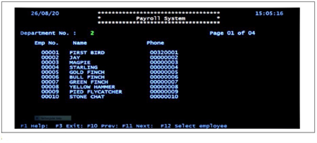
Back in the mainframe days and through into early DOS type personal computers, the “Green-Screen” display was king. All information was just textual and very simple, usually green text on a black background, but then we got color text on a black background.

As you can see from the date on the image (August 2020), there is still a lot of this about.
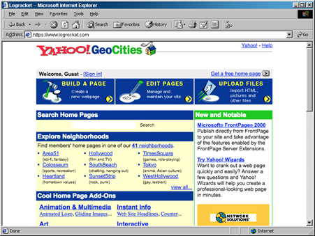
Then the World-Wide-Web started to creep in, but all web pages just looked like an index to the rest of the Web. No real interaction, but a new way to show Information that included some formatting and graphics.

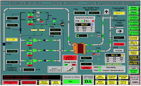
In the meantime, industrial control system UIs were written using purpose-built applications, leading to rather visually complex layouts with little interaction.

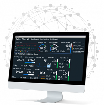
But what if you take the data that would populate a purpose-built application and use it to drive a web-based UI? You get all the advantages of modern web technologies to build the UI. The visualization can be as simple or complex as is demanded by the system being controlled while allowing click or touch-based interaction to drill down on the data and get meaningful analytics.

Then you can design the UI to give a meaningful UX. The look and feel can be adjusted to better match the needs of the human users. This does mean that attention must be paid to the UI design, particularly as this approach is so much more flexible.
Which brings me back to how we design the UI for the improved UX. Good UI = Good UX! There are several factors that contribute to good UI design which broadly fit into two categories: Visual Design and Functional Design. The following is by no means a definitive list!
Visual Design
Simplicity. Don’t overcomplicate with all sorts of graphics and other visual elements that you think look good but just confuse the eye, nor too many options to pick causing the user to have to think too much to perform a simple task.
Color. Use only a few colors, that have meaning, “Danger” is Red, “OK” is Green, and use contrast so that it is not difficult to tell one color from the other.
Imagery. Do have some images and icons, not all text, or it will look like a 1990s web page. Images and icons can give the “mood” of a page, so be consistent. “A picture can save a thousand words” so make use of that. Keep images that do the same thing the same everywhere, otherwise it will be confusing. But don’t forget how explicit text can be when compared to sometimes vague images.
Typography. Where text is used, consider the font and size as if you were considering the design of an image. Just because it’s only simple text doesn’t mean it should not be designed for visual impact and readability.
Visual Impairment. Not every user will have 20/20 vision or distinct color perception. Please take this into account!
Functionality
Purpose. Don’t forget the purpose of the UI design in the HMI. It does not matter how good the visual design is if you can’t get the job done when using the interface.
Function. Don’t hide functions away in places that are difficult to find. Sounds obvious, right? But how many times have you found it so difficult to find the “Logout” button that you just close a page? Make it obvious which elements of the UI perform functions as opposed to just those that just deliver information.
Confirmation. Let the user know when an action has been completed or failed–don’t leave them guessing. For actions that cause a change, especially a critical change, ask them if it’s OK to proceed. If they click on the “Shutdown the Power” action, ask “You have just asked to shut down all power to the Production Line Machines? Do you want to proceed?”.
Assistance. Often forgotten, but the help information on what an action does, or what a visual element means, really helps.
UI design has improved vastly over the years. There is a wealth of information available on good UI design that is well worth the effort of reading as the UI is the last part of the interface to humans in an HMI.

